Video and Sound Production PROJECT 2
ZHANG HANYUAN/0363727/Bachelor of Design (Honors) in Creative Media
Video & Sound Production /Taylors University
Video and Sound Production - PROJECT 2
LECTURE
Color Grading vs. Color Correction Process for Video: A Complete Guide(Post-production)
The basics of digital video color
The process of properly coloring your footage is made up of three main interconnected tasks. Like any other recipe or formula, it is a general rule to do each of these tasks in their proper order, step by step.
Digital video coloring steps:
- Establish picture profile
- Color correct footage
- Color grade footage
These steps come with their own sets of micro-tasks, and with their own specific orders. Before we go on, let's quickly break down our two "title processes" of color grading and color correction to keep everyone on the same page.
COLOR GRADING VS. COLOR CORRECTION
Color correction is a technical process that fixes color issues and makes footage appear as naturalistic as possible. The idea is for colors to look clean and real, as human eyes would see them in the real world.
Color grading is also technical, but it's more of a creative concern. The color grading process adds atmosphere and emotion to shots by coloring footage in new, often unnatural ways.
What is color hue?
Hue refers to the color itself. In simplest terms, it’s the difference between red and blue. Your hue can then be altered by saturation and brightness, which we'll cover as soon as we give you a few paragraphs on hue.
Together, hue, saturation, and brightness are known as "HSB." This combination makes up the basic color concerns of any video image.
Hues don’t always have to be vivid, primary colors.
A skin tone, for instance, might be a brown hue that has very little saturation, and a lot of brightness — giving us a "fair" skin tone.
That same hue can be saturated and darkened to give us a different skin tone, all while still corresponding with the brown hue. Some skin tones will have different jumping off hues, so use your spot sampler to identify.
What is color saturation?
Saturation refers to the intensity of the color. This is determined by the amount of grey in the hue, from pure grey, to a vivid color.
Saturation is where you really get to make your colors "pop," or, at the other end of the spectrum, become "muddy." Believe it or not, this is all due to the amount of grey information in the color. Seems simple, right?
If you add pure white or pure black to your color, you’ll get a darker or lighter brightness value, which is our next category.
What is color brightness?
Brightness refers to the level of light in your color. This determines the difference between, say, burgundy and candy apple.
The hue for each is still red, and the saturation is at the max for each, but the amount of white and black in the color value is different. A color with intense saturation that has a high brightness value might make the viewer feel energetic and happy, whereas the same hue with a high saturation and low brightness value may evoke dread.
Is blood creepier when it is bright or when it is dark?
Those are fun questions that can come up during pre-production, and be emphasized and seized upon during the coloring process.
In order not to destroy the image quality and reduce the production value, you need to know these
1. White Balance
White balance is the same thing in your camera as it will be in coloring programs. It describes the color temperature of your image.Your white balance should be one of the first things you do, because it will affect every single decision you make from there on out.
2. Scopes You will want to use scopes (Waveform, Parade, Histogram, Vectroscope) to give you some extra value color info that you didn’t see initially.Scopes are a monitoring tool that show color and light information on a graph so that you can see the precise balance of these characteristics and how they compare to one another.
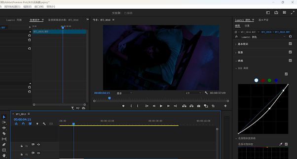
3. Curves Curves are helpful for precise color correction and color grading, and you will want to pair these with your scopes.
With curves, you can add points to drag colors to new values, and change shadows, midtones, and highlights with much more precision.
4. Color Match Color match allows you to choose a reference image that will then be analyzed and applied to your target image.
This is an automatic calculation, so it is important to check your scopes and use your judgement as to the quality of the color match.
5. Three-Way Corrector Three-way color correctors are a useful tool for many colorists in professional entertainment, but they have their pros and cons.
The three-way color corrector lets you balance the shadows, midtones, and highlights of an image using color wheels. You can set numerical values, or use the control drag point to set your value based on hue.
6. Color Qualifiers Color qualifiers give you the chance to change a particular color, or range of colors, without changing the rest of the picture.
7. Color Masks In the DaVinci program, color masks are called Power Windows. These work a lot like masks in Adobe Photoshop. You can designate a shape to isolate its colors.
In-Class exercises:
Here, I darkened the overall color of shoot 1 and added some warm tones to express that she is sleeping soundly.
Here, I brightened up shoot 2 as a whole, adding more white and highlights. I want this to highlight that it is daybreak, with a lot of light projected into the room.
Color correction practice VIDEO
Quiz Results:
PROJECT 2B FINAL TIKTOK/INS VIDEO


Comments
Post a Comment