Interactive Design-Project 1: Prototype Design – Digital Resume/CV
23/Apr/2024
ZHANG HANYUAN/0363727/Bachelor of Design (Honors) in Creative Media
Interactive Design /Taylors University
Project 1:Prototype Design – Digital Resume/CV
INSTRUCTIONS
Prototype Design – Digital Resume/CV
Requirements:
1. Content and Structure:
Your UI design prototype assignment will be evaluated based on the following criteria:
1. Content and Structure:
- Prepare the content for your resume,
including personal details, education, work experience, skills,
projects, and other relevant sections. - Decide on the order and hierarchy of
sections based on their importance and relevance.
- Design the layout of your digital resume using the chosen prototyping software. Define the placement of different sections and how they will flow together.
- Apply a consistent visual design using typography, color palette, and appropriate spacing.
- Organize your resume into logical sections, such as "Profile," "Education," "Experience," "Skills," "Projects," and "Contact."
- Prioritize sections based on their relevance and significance to the position you're targeting
- Incorporate relevant images, icons, or placeholders that align with the content and enhance the visual appeal of your digital resume.
- Update your e-portfolio explaining and showcasing the processes of the task
Your UI design prototype assignment will be evaluated based on the following criteria:
- Clarity and effectiveness of the UI design, layout, and visual elements.
- Appropriateness of the chosen typography, color palette, and imagery.
Week 5
Visual References
To start this project, I first began with some research on the design of resumes and CVs, taking note of the layout, sections, content, style and visual elements.
I found some inspiration on Pinterest and examples from teachers in Google Classroom.
Color Palette
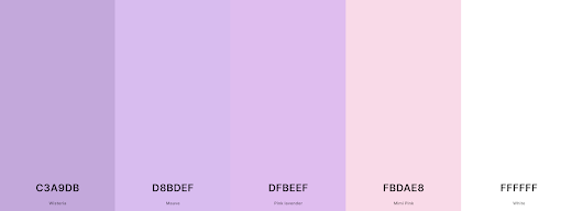
For the color palette, I used the palette on the Coolors platform, using more blue and purple, because I think purple will give people a sense of mystery. Making a gradient background I didn't want the colors to distract from the content, so I kept the colors as subdued as possible.
The combination of dark blue and dark purple is professional and calm; the contrast is moderate: the two are similar in hue, but dark purple is slightly warmer, which can bring a little warmth to the overall cold tone. Enhance visual hierarchy.
fig.5.2 background color
I think a gradient background, a larger dark color area, and the use of light fonts can create a clear sense of hierarchy.
fig.5.3 font color
Layout Design
Font
I chose the font ‘Moul’. 'Moul' font is a popular Cambodian-Khmer font, especially used for writing and typesetting Khmer text.
1.Moul font is known for its bold design, making it very eye-catching in titles and important text.
2. Due to its bold design, I think ‘Moul’ is perfect for headings to ensure high visibility and legibility.
fig.5.5
fig.5.6
Montserrat font is a popular sans serif font designed by Julieta Ulanovsky. Named after the Montserrat neighborhood of Buenos Aires, the font’s design was inspired by the area’s traditional symbols and signage. Montserrat font is modern, simple and geometric, making it perfect for web fonts.
I will be using the ‘Montserrat’ font for subheadings and body text.
fig.5.7
fig.5.8
Process
I used Figma for prototyping-Digital Resume/CV
First, use the Frame Tool to draw a frame.
fig.5.9
Secondly, use auxiliary lines to determine the approximate position.
fig.5.10
Then change the background color to the desired color, and then use the shape tool to pull out the shape you want. The pulled graphics can contain some pictures, such as icon materials.
fig.5.11
I used Photoshop to deduct the avatar, hide the white background, export it, and insert it into the figma shape.
Preliminary CV
fig.5.12.Preliminary CV. jpeg
Week 6(After feedback)
Final prototype design
fig.6.2.Final CV. pdf
Feedback:
week 5:
UI Design Prototyping: 1. Clarity and effectiveness of UI design, layout and visual elements. 2. Appropriateness of chosen typography, color palette and images.
week 6:
The right half of the digital CV is well done, but the real photo needs to be changed. The left half is a bit crowded, so change it.


Comments
Post a Comment