Typography | Task 1 : Type Expression & Formatting
22/Apr/2024-25/May/2024-Week1-Week5
ZHANG HANYUAN/0363727/Bachelor of Design (Honors) in Creative Media
Typography/Taylors University
Task Exercise 1 & 2
LECTURES
Lecture 01: Introductions
In lecture, Mr. Vinod introduced us to typography. He explained that Typography is an act of creating typefaces or type families. I learned that typography has envolved over 500 years from calligraphy to digitalization. It is "the art and technique of arranging type to make written language legible, readable, and appealing when displayed". And the process also created numbers and symbols. Typography is now something everyone dose.
Typography can be seen at everywhere in our daily lives, Typography is applied in animation, website design, application design, posters, books and more.
Font: refers to the individual font or weight within a typeface, I.e.: Georgia Regular, Georgia Italic and Georgia Bold or Frutiger Light, Roman.


Lecture 02: Development/ Timeline
In lecture 2, we learnt about the development and timeline about typefaces.
1.Early letterform development: Phoenician to Roman: Initially writing meant scratching into wet clay with sharpened stick or carving into stone with a chisel. The forms of uppercase letterforms (for nearly 2000 years the only letterforms) can be seen to have evolved out of these tools and materials. At their core, uppercase forms are simple combination of straight lines and pieces of circles, as the materials and tools of early writing required.


The Greeks changed the direction of writing. Phoenicians, like other Semitic peoples, wrote from right to left. The Greek developed a style of writing called ‘boustrophedon’ (how the ox ploughs), which meant that the lines of text read alternately from right to left and left to right. As they change the direction of reading they also changed the orientation of the letterforms:

Etruscan (and then Roman) carvers working in marble painted letterforms before inscribing them. Certain qualities of their strokes—a change in weight from vertical to horizontal, a broadening of the stroke at start and finish—carried over into the carved letterforms.


Late 1st century B.C.E., Augustan inscription in the Roman Forum, Rome.
2.Hand script from 3rd – 10th century C.E.: square capitals were the written version that can be found in Roman monuments. These letterforms have serifs added to the finish of the main strokes.

4th or 5th century: Square Capitals
A compressed version of square capitals, rustic capitals allowed for twice as many words on a sheet of parchment and took far less time to write. The pen or brush was held at an angle of approximately 30° off the perpendicular. Although rustic capitals were faster and easier to, they were slightly harder to read due to their compressed nature.

Late 3rd – mid 4th century: Rustic capitals
Both square and rustic capitals were typically reserved for documents of some intended performance. Everyday transactions, however were typically written in cursive hand in which forms were simplified for speed. We can see here the beginning of what we refer to as lowercase letterforms.

4th century: Roman cursive

4th – 5th century: Uncials

C. 500: Half-uncials

C. 925: Caloline miniscule


c. 1455: 42 line bible, Johann Gutenberg, Mainz

Week2:
Lecture 03: Typo_3_Text_Part1
1.Text/ Tracking and Letterspacing
Kerning is often incorrectly referred to as "letterspacing". In fact, it's adjusting the spacing of the letters and spacing the letters means increasing the horizontal space between the letters.


1. The font form of the field accounts for half of the page.
2. Font size: The font is large enough to stand out.
3. Line spacing: text Settings are too tight, which will cause visual fatigue.
4. To facilitate the reader to find the reading location at that time, it should be designed with memory points.
5. Line length: The proper line spacing of text is also a function of line length, because it is a matter of word size and line spacing. Keep the line length roughly between 35 and 65 characters. Very long or very short. Presidents influence readers to read.


The text draws the reader's attention at a glance.


Week3:
Lecture 04: Typo_4_Text_ Part2
Typography: Text / Indicating Paragraphs
The paragraph option we see here is pilcrow '(¶) (the symbol available in most number bodies), which is left over from medieval manuscripts.


Format: Text/Widows and Orphans


In the article, several sub-headings of different plates are combined in a screen, and we can see the hierarchy of the article layout.


Week 04
Lecture 05: Typo_2_Basic


Barb The half-serif finish on some curved stroke.


Bowl The rounded form that describes a counter. The bowl may be either open or closed.

Bracket The transition between the serif and the stem.


Cross Stroke The horizontal stroke in a letterform that joins two stems together

Crotch The interior space where two strokes meet.
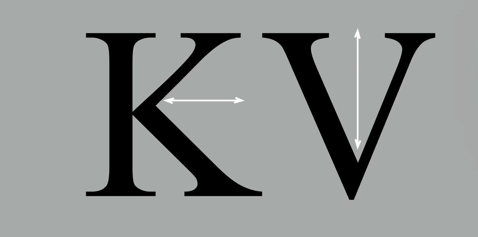
Descender The portion of the stem of a lowercase letterform that projects below the baseline.


Task 1: Exercise 1-Type Expression
Week 1
For the first week of practice, we are going to choose four words and make them in a class arrangement.
-time
-open
-kick
-spark
We need to sketch each word first, and then make a digital illustration.
My Sketch :


FINAL Text Formatting Layout
HEADFont/s: Bembo Std
Type Size/s: 72 pt
Leading: 36 pt
Paragraph spacing: 0
BODY
Font/s: Bembo Std
Type Size/s: 9 pt
Leading: 11 pt
Paragraph spacing: 11 pt
Characters per-line: 60
Alignment: left justified
Margins: 123 mm top, 26 mm left + right + bottom
Columns: 2
Gutter: 10 mm
Things to look
- Font size (8–12)
- Line Length (55–65/50–60 characters)
- Text Leading (2, 2.5, 3 points larger than font size)
- Paragraph spacing (follows the leading)
- Ragging (left alignment) / Rivers (Left Justification)
- Cross Alignment
- No Widows / Orphans
Feedback
Week 1
Specific Feedback: Add a description to the profile, and update lecture notes for Lecture 01- Development. Add task explanation, research, and letterform sketches with descriptions.
General Feedback: Update what we learn on the e-portfolio consistently to avoid crashes of upcoming tasks.
Week 2
Specific Feedback:For sketches, please digitize 1st option for Time; 1st and 3rd options for Open; 1st, 2nd and 3rd options for Kick; 1st options (Bold one) for Spark. Good job!
General Feedback:Try to explore more software options in addition to more digital concretization. The illustration course can give more consideration to multiple levels and various fields to provide a visual impact and form of expression.
Week 3
General Feedback:Mr. Max asked me to change the one after the blog link to the correct one (tag link).
Week 4
Specific Feedback: We need to be more serious about updating the blog.General Feedback:After this week's study, Teacher Max helped me correct the font style and not align the word spacing with the grid. Through the teacher's operation, I understood that I can change the paragraphs by scrolling the text.
Experience:
By repeatedly watching the content teaching and self-study of the videos recorded in advance by Teacher Vinod, my ability to understand and master design concepts and materials in self-study has been greatly improved in the future. This is of great help to me because I can watch it repeatedly at my own pace. And Mr. Max’s careful teaching to us, teaching me the technology of Adobe software through feedback assignments, and every week we have to carefully check our digital portfolio (blog) to help us make progress, and we also need to improve the improvements we have made. Giving feedback, which is the same as we progress each week, helps me a lot. I also like that the teachers in our class look at our blog assignments and complete our assignments in practice.
Observations:
Findings:
2. The readability of text is closely related to font size. Generally, the main text uses 10-12 point size, and the title varies according to the level. Line height is between 1.2 and 1.5 times the font size to ensure proper line spacing and increase readability.
3.Adjust the gaps between adjacent characters to make text look more even.
4.Left-aligned, right-aligned, center-aligned, and aligned at both ends, each has different usage scenarios and visual effects. Left-aligned is the most common, and justified is often used in formal documents.
5.By understanding and practicing these layout principles and technical details through the videos given by the teacher, you can achieve beautiful and practical text layout effects and improve the efficiency of information transmission and reading experience.
FURTHER READING
I chose one of the books recommended by my teacher to read. Although I did not go to intensive reading, I also gained some more or less.

This book is a practical introduction to typography, analyzing the basic principles and applications of typefaces. From measuring fonts and classifying fonts to organizing text on a page and understanding grid systems, the authors cover everything a beginner in graphic design needs to know. In addition, he presents a brief history of typography, numerous examples to illustrate the ideas presented, and a series of useful exercises to help the reader put the fundamentals into practice. This book is engagingly written and a valuable resource for all students of graphic design and typography.


Comments
Post a Comment