Advanced Typography / Task 2A & 2B
18/Oct/2024- 15/Nov/2024 (week 4-week 8)
ZHANG HANYUAN/0363727/Bachelor of Design (Honors) in Creative Media
Advanced Typography/Taylors University
Task 2A & 2B
LECTURES SUMMARY:
WEEK 5 LECTURES:
Perception & Organization
Perception is “the way in which something is regarded, understood, or interpreted”.
Content can be textual, visual, graphical or in the form of colour.
Content can be textual, visual, graphical or in the form of colour.
Light/Bold,Condense/Extended,Organic/Machnied,Roman/Italic,Small/Large,Negative/Positive,Serif/Sans,serif,Ornate/Simple,Red/Blue.
Contrast
- a method of organizing content
- to make design work & its meaning pop out clearly with flair
 |
| Fig 1.1 Different methods of adding contrast |
Carl Dair's Seven Typo Contrasts
- Size
- to draw readers' attention to a certain point
 |
| Fig 1.2 Size contrast |
- Weight
- it describes how bold type can stand out in lighter type of the same style
- helps in creating a power point in a composition
 |
| Fig 1.3 Weight contrast |
- Form
- the distinction between capital & lowercase letters / roman & italic variant / condensed & expanded
 |
| Fig 1.4 Form contrast |
- Texture
- different contrasts of size, weight, form & structure
- it refers to the way lines of type look up close & from a distance
 |
| Fig 1.5 Texture contrast |
- Direction
- the opposition of vertical & horizontal, utilizing different angles
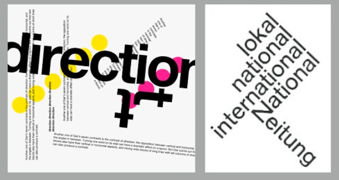 |
| Fig 1.6 Direction contrast |
- Color
- helps highlight certain information that is in color as compared to plain bnw
 |
| Fig 1.7 Color contrast |
- it is the overall look & feel of elements in a typographic composition
- plays a role in visual impact, it leads the eye from point to point
 |
| Fig 1.8 Form |
 |
| Fig 1.9 Form |
- German word meaning the way a thing has been placed/put together
- Gestalt Theory: emphasizes the entirety of anything is greater than its parts
- basically means in a design composition, the components of it is not greater than its overall form
- Law of Similarity: elements that are similar tend to be perceived as a group
- Law of Proximity: elements placed close together tend to be perceived as a unified group
- Law of Closure: the mind's tendency to complete forms/pictures even when they're incomplete/hidden
- Law of (Good) Continuation: people tend to perceive 2 or more objects as different, singular & uninterrupted even when they intercept
 |
| Fig 1.10 Examples of the different laws |
INSTRUCTION
Task 2A: Key Artwork
Mind Mapping/ Inspiration
I started by making a mind map in Canva.
Moodboard
Then, I look for inspiration and references on Pinterest based on what I have in mind.

fig.1.2
sketch
After getting inspiration, I chose the full spelling of one of the characters in my name: YUAN, and drew a sketch first.

fig.1.3
Digitalization

fig.1.4

fig.1.5
In the sixth week, Mr. Vinod looked at my digitization and confirmed my design idea, but he thought that there were too many semicircles and needed to be changed. Then Mr. Vinod gave me some suggestions.

fig.1.6
After finishing digitising the keywords, I looked for the right palette in colourhunt.

fig.1.7
Then Mr. Vinod asked us to finish it and give it to him for approval.
- Black wordmark on white background
- White wordmark on black background
- Color palette
- Wordmark in actual color on the lightest shade of the palette
- Wordmark in the lightest shade of the palette on the darkest shade of the palette

fig.1.8
Final colour work

fig.1.9

fig.1.10
Final Project - 2A
1024px x 1024px, 300ppi.

fig.2.1

fig.2.2


fig.2.4

fig.2.5
PDF
Task 2B: Collateral
Before I start working on the secondary artwork, I watch some examples for reference. I find it’s easy to get visually fatigued if I only use one key artwork. So I explore and expand my artwork.

fig.2.6
I changed the color of the expanded design in the lower right corner because I feel that gray lacks visual impact. My design needs to express vitality, innovation and a sense of the future, and gray may weaken these emotional associations.

fig.2.7
Then I explored different expansion designs.


fig.2.8
This pattern, a semicircular design, is a gradually spreading form, similar to the way celestial bodies are arranged around a star or orbit, representing the phase changes of a planet or moon in orbit, or some kind of cosmic cyclical concept.
Then I started adding my expanded designs to my selfies.

Finally, I created the collateral on the Mockups website and ultimately chose three items - a hat, two rolls of tape, and a sign to hang on the wall.


fig.2.12

After Mr. Vinod’s online guidance in class, he felt that my hat theme did not match the other two and should be related to the main image. Mr. Vinod suggested that I incorporate the main image in the color scheme into the hat accessory design so that there would be a connection.
I then modified my cap collateral design based on Vinod sir’s suggestions to incorporate the key artwork into the cap collateral.

fig.2.14
Then, I designed the layout of the Instagram page using Adobe Illustration.

fig.2.15 IG design (week 7)
Wordmark animation
When experimenting with animation, I first choose to create the clips I need in the illustration.
Final animation:(Gif format)
.gif)
Final Project - 2B
1024px x 1024px,300ppi

fig.2.16 Collateral 1


fig.2.18 Collateral 3
Instagram link:
Instagram Screen shot:

fig.2.19 Instagram Screen shot
PDF:
Feedback
Week 5
General Feedback:
This week, Vinod sir checked our digital layout.
Specific Feedback:
Let me finish the mind map before I start the sketch.
Week 6
Overall feedback: Mr. Vinod thought my idea was interesting, but the shape of the font needed to be modified. Secondly, he asked me to bring paper and pen to class in the future.
Specific feedback: Mr. Vinod chose one of my ideas based on several different ones. He thought that the overall size of my work was too small. After enlarging it, it could be more prominent, and the semicircle patterns could be reduced from five to three.
Week 7
Overall feedback:
Mr. Vinod thought my expansion design was OK, but my collateral needed to be changed. The expansion design should be related to the three collaterals.
Specific feedback:
The three collaterals should be related to each other and should highlight what the brand is looking for.
Experience
I found Task 2 to be a very interesting experience full of exploration. In Task 2A, we had to design a key artifact for our brand and in Task 2B, we had to explore the key artifact and put the exploration results on collateral. Although I felt confused at times during the exploration, the results were good. Vinod sir also helped me a lot in the process.
Observation
After this exercise, I have some new insights and reflections. I found that brand design and personal key design drawings need to find a balance between meaningful expression and artistic beauty. At the beginning, I paid too much attention to the "artistic" design, and put more energy on complex shapes and unique visual effects, but ignored the most core element of brand design-readability.
The main purpose of brand design is to convey clear information and leave a deep impression, rather than simply pursuing artistic expression. If a design is too complicated or difficult to recognize, it will lose its functionality and practicality. This exercise made me realize that while pursuing creativity and beauty, it is necessary to ensure that the font, logo or graphic design can be easily understood and remembered by the target audience. This is the key to excellent brand design.
Finding
When designing a logo, we should not blindly pursue uniqueness or over-emphasize artistry, but should focus on meeting the needs of the public and pay attention to the readability and actual functionality of the logo.
Furture reading
Founded in 1985, the Atlantic Theater Company in New York is one of the city’s most influential off broadway theatre companies and is known for its daring productions by new and established playwrights. Pentagram partner Paula Scher has designed a new identity that successfully gives the company a visual personality that matches its bold approach to theatre.
Paula worked closely with the Atlantic’s artistic director Neil Pepe and managing director Jeffory Lawson throughout the process and the team were keen to have a graphic identity to “raise its institutional profile and stand out in the city’s crowded arts landscape.” Producing six new productions a year, it was key the identity could be adapted but still remain consistent. The identity extends across posters, programmes and other promotional material and utilises found imagery, montages and photo illustrations alongside the spotlight-like “A” shape that serves as the Atlantic’s emblem. In bright hues of blue, red and white, the topographic-based identity is strong, punchy and perfectly encompasses the spirit of the Atlantic and the shows it stages.
Paula worked closely with the Atlantic’s artistic director Neil Pepe and managing director Jeffory Lawson throughout the process and the team were keen to have a graphic identity to “raise its institutional profile and stand out in the city’s crowded arts landscape.” Producing six new productions a year, it was key the identity could be adapted but still remain consistent. The identity extends across posters, programmes and other promotional material and utilises found imagery, montages and photo illustrations alongside the spotlight-like “A” shape that serves as the Atlantic’s emblem. In bright hues of blue, red and white, the topographic-based identity is strong, punchy and perfectly encompasses the spirit of the Atlantic and the shows it stages.

fig.3.1 Atlantic Theater Company(1)
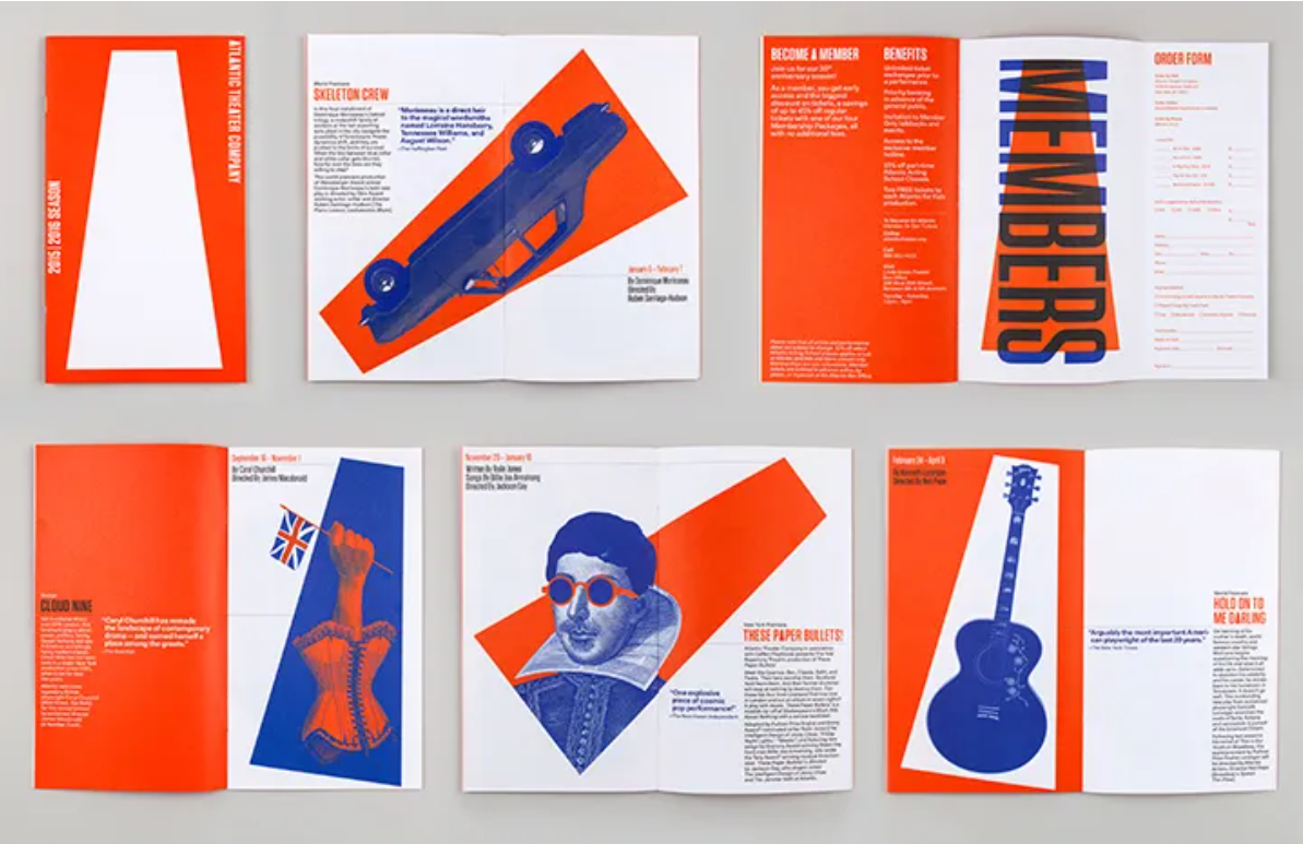
fig.3.2 Atlantiv Theater Company(2)
Studio Theatre
Visual identity, environmental graphics and poster campaigns for the influential theater company in Washington, DC.The identity captures the ‘made-in-DC’ culture of the non-profit theater company and expresses its creative ambitions as a force for engaging, socially relevant, and artistically daring performances.
fig.3.3STUDIO(1)

fig.3.4STUDIO(2)

fig.3.5STUDIO(3)


Comments
Post a Comment