Typography / Task 3: Type Design & Communication
17/June/2024- 15/July/2024-week 8-week 12
ZHANG HANYUAN/0363727/Bachelor of Design (Honors) in Creative Media
Typography/Taylors University
Task 3: Type Design & Communication
Introduction
LECTURES
Week 7:
This week in Teams, Mr. VINOD asked us to choose a favorite font from the ten provided. Using the following letters H, o, g, b, do a detailed anatomy of the letters, using the following 3 strokes of the letters ODHNG/ODHNG. Explore the three different writing styles with these three pens.
In class, Mr. Max introduced us to the guidelines for a new project and explained what to do in preparation for the next work. Mr. Max introduced us to the types of pens used to draw letters and provided some sample videos for us to watch after class to start drawing letters.

fig.7.1

fig.7.2
Research:
In Teams, Mr. Vinod posted a video to watch.
In class, Mac carefully taught us to use Adobe illustration software to analyze the letters T, y, d and m in detail.

fig.7.3
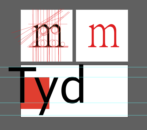
fig.7.4
In the team, Vinod sir asked us to analyze the letters in detail for H, o, g and b using one of the 10 fonts provided and write down the observations.
I used Adobe illustration software to dissect the letters H,o,g, and b in detail.

fig.7.5

fig.7.6

fig.7.7
sketch:
I chose three different types of fonts from the 10 fonts given by the teacher, and three different font styles were selected in each of the three fonts. Among them, I used flat pen, soft brush and round pen, and the strokes of the three pens were different.

Draft 1.fig.7.8

Draft 2.fig.7.9

Draft 3.fig.7.10
Week 9:
Text digitization:
During class, Max looked at the sketches I made with three different brushes and chose three fonts he thought looked more stylish from Draft 3 for later type design. I personally prefer the soft tip brush and continued to write the rest of the words (o, l, e, d, s, n, c, h, t, I, g, and #) in this style and digitized them.

fig.9.1
I chose a font I liked more for the later font design.

I modified the letter step by step. The design of this letter didn't quite fit in with the rest of the letterform. I made some changes.
I don't want to make it too complicated, I want to make it trendy and simple. The fonts and symbols are gradually simplified, showing the design process from complex to simple.

fig.9.3

fig.9.4
Based on Mr. Max's suggestions, I made some modifications and completed the final digital font design.

fig.9.5

fig.9.6

fig.9.7

fig.9.8
Week 11:
Development of fonts in FontLab 7
When I finished pasting the letters, I found that the proportions of the design I had made were not adjusted properly, so I went back to the illustration to fine-tune the width and height.

fig.11.1

fig.11.2

fig.11.3

fig.11.4

fig.11.5
After completing the digital font, we need to import the font from Adobe Illustrator into FontLab 7 to process its kerning and spacing. At the beginning I aligned the spacing of my draft.

fig.11.6

fig.11.7
At first, I did it wrong, so Mr. Max asked me to change it according to the example chart of letter lateral values sent by Mr. Vinod.

fig.11.8 Example table of horizontal values
After the change:
Teacher Max asked me to change the size of the period.

fig.11.10First revision

fig.11.11Second revision
Week 12:
FINAL Task 3: Type Design & Communication
Download font here:
'Hanz' font link:

fig.12.1 Screen Grab of FontLab process (side-bearings)

Fig.12.2 "HanZ" (JPEG) The Final font
Fig.12.3 "HanZ" (PDF) The Final font
week 13:
Final black and white poster
Final black and white poster

fig.13.1 Final Poster (JPG) Black

fig.13.2 Final Poster (JPG) White
fig.13.3 Final Poster (PDF) Black
fig.13.4 Final Poster (PDF) White
Feedback:
Week 7:
General feedback: Considerations when drawing fonts, how to draw sample strokes.
Week 8: Review week
Week 9:
General feedback: Remember to divide the letters into 3 art boards when digitizing them, keeping the original strokes so that you can easily change the letters if needed.
Week 10:
General feedback: Keep all letters and strokes consistent.
Specific feedback: Start digitizing my font and make changes to my font in class as instructed by the teacher
Week 11:
General feedback: Pay attention to the trace points imported into Fontlab 7 letters to reflect the main trace curve.
Specific feedback: During the break, the teacher saw that we could not use Fontlab 7 software, and taught another student in person. We watched and learned.
Week 12:
General feedback: Use the kerning standard given by the letters O and H, compare the spacing of other letters, adjust to the appropriate spacing, it will look more beautiful.
Specific feedback: In this week's exercise, I learned more about fontlab software through font creation, which gave me knowledge and understanding of font orientation measurement.
REFLECTIONS:
Experience: in my assignment for this module, I learned how to write English fonts using soft brushes, and the process of making fonts gave me a whole new perspective on font making and its difficulty. This was the first time I made my own font, and it was imperfect but rewarding!
OBSERVATION: In this assignment, I looked at a large number of font frames to find my own font characteristics in order to design the ideal font. I also found a lot of key points during the observation process, such as the different positions of different letters.
Discovery: After this exercise, I gained a better understanding of the process of creating fonts and I learned that it is not the uniqueness of each letter that creates the perfect font, but the harmony and connection between the letters. I also explored more illustration tools and learned about the nuances between letters. I realized that making fonts is actually much more difficult than I thought it would be. The precision required to make one is astounding. Honestly, I think I could have done better, but it's too late. I may try to create a new one in my free time, though.
Further reading:
From the 7 books recommended, I chose Typography reference as my reading material for my further reading.

Precise visual communication requires first-rate typography skills


Comments
Post a Comment